
 Are your online products receiving a lot of clicks but a not of sales? The bad news: a high click-thru rate coupled with a low conversion rate means your business is wasting resources on ineffective marketing. The good news: unless your companys website is stuck in the dial-up era, you dont need to completely overhaul your site in order to improve Internet marketing.
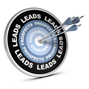
Small tweaks to your website and improvements to your online marketing strategy can streamline the conversion process, making a big difference for online sales. Could your Internet marketing use a boost? Read on for five easy design tweaks to improve your Internet marketing.
1. Match your landing page to your ad
While this may seem obvious on paper, in practice, many businesses fail to match the content of their landing page to the content of their call-to-action. First impressions count: give visitors exactly what they want and are expecting. For example, if web visitors just clicked on a call-to-action for your newest product, dont redirect your visitors to a generalized service page. Take them directly to a custom landing page where they can sign up to start a free product trial. Continuity sells: from the call to action to the landing page colors, mimic your ads design on your landing page. These subtle visual cues will help increase conversion rates.
2. Dont play hard-to-get
Can potential customers easily find your website? What about your products? A quirky website address or a complicated home page that hides your best-selling products will leave would-be customers confused. Minimize distractions: showcase your star product front and center on the homepage. Position key content above the fold. Be assertive with your headlines: succinctly convey your products importance and benefits. On your landing pages, remove unnecessary back buttons, menus or any other web features that distract customers from downloading a premium content offer or completing a purchase.

3. Offer checkout codes
From C-level execs to stay-at-home parents, everyone loves a good deal. Promotions wont do your business much good, however, if they are hidden at the bottom of an online order form. If your business offers free or flat rate shipping, for example, make sure this offer is front and center on your home page, every product page, and your websites check-out form. Include an expiration date on specialty codes. While logically your customer knows that your business is likely to offer additional codes in the future, from an emotional standpoint, deadlines help incentivize customers to make an immediate purchase.
4. Streamline the checkout process.
How many hoops do your customers jump through in order to complete a sale? The more form fields or login codes you require, the fewer customers you will have. Individuals who are distracted, busy or otherwise less-than-motivated to make a purchase are more likely to abandon a lengthy check-out process, especially if pre-registration is required.

5. Design for mistakes
How good is your websites contingency design? From incorrect web addresses to incomplete forms, good design should account for human error and help would-be customers complete a purchase rather than leaving them frustrated. For example, if a customer fails to completely fill out a form (e.g., forgets a credit card security form), dont erase the entire form; nothing makes would-be customers more annoyed than having to re-type an entire form simply because one piece of information was incorrect. Finally, if one piece of information is entered incorrectly, dont slap customers with a FAILURE error message; a friendly oops something isnt quite right message is a much better choice.
Summary
Ten years ago, anyone who threw together a website could sell products online. In todays competitive marketplace, however, sophistication and optimization matter. Dont waste money chasing online sales leads and then let poor web design fail to convert these leads into real customers. Strategic design and a streamlined checkout will take help turn your customers' clicks into sales.