


 By now, you have probably heard about Google's latest search algorithm update that has been dubbed "Mobilegeddon." And with good reason. According to Google, Mobilegeddon “will affect mobile searches in all languages worldwide and will have a significant impact in our search results. Consequently, users will find it easier to get relevant, high quality search results that are optimized for their devices.” In other words, if your website isn't optimized for mobile, good luck getting found.
If that doesn't get your attention, consider the fact that "for Google, mobile comprised almost half of all traffic from June to November (2014), with 52 percent coming from desktops and 48 percent from mobile." (Source = ClickZ) So if your site isn't optimized for mobile, you're disappointing half of your site visitors. You're also letting your brand down: when people see a desktop site on a mobile device, it makes you look unprofessional.
Here are a few things to consider for your mobile optimization strategy.
Customize your mobile experience
Many responsive Content Management Systems automatically create versions of your website that are optimized for mobile phones and tablets. We recommend that you consider taking it one step further and customize your mobile site rather than letting the CMS do the design automatically.
We find that most times, the CMS will render a site that provides an acceptable user experience for mobile users, but could use a little improvement. We have a credo at our company that the details make the difference between a good site and a great site. We customize the mobile sites we design to provide a great user experience. Some of the details we optimize include:
- We make sure that the mobile site closely ties back to the desktop site. Most design editors render a version of the site on the designers desktop screen. These mobile renders don't always match up with exactly what shows up on an iPhone or an Android. We make sure to look at our work on the actual device to make sure the site is rendering as intended.
- We find that many of the automated renders create navigation tools that are a bit clunky. We always customize the navigation to provide a sleek experience for mobile users.
- Although mobile connections speeds are quickly catching up to desktop, many users are accessing your site via 3G and other lower speed connections. We make sure to optimize mobile page load times. This may take the form of replacing the videos that render on the desktop with an image that renders on the mobile version.
For an example of how we optimize sites for mobile, the image below shows a side-by-side view of the Rapidan Inbound mobile and desktop sites. What you can't see in the image is that we've replaced the video on the homepage with an image on the mobile site for faster pageloads.

Does your website pass Google's test?
As you remember, we started this article by talking about Google's mobile algorithm update that was effective on April 21, 2015. We consider Google's test a "lowest common denominator"; our test for our mobile sites is much stricter. Regardless, there's an easy way to see if your site will be negatively impacted by the Google algorithm update. This is Google's mobile-friendly test, here's what you will see when you take it.
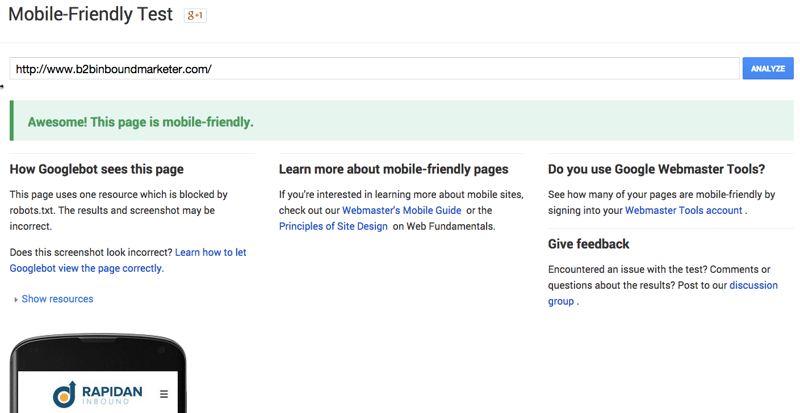
If you don't pass this test, contact us immediately! You will likely be penalized by Google.
Other things to keep in mind
The issues we discussed above are just some of the basic things to keep in mind as you optimize your mobile strategy. Depending on the type of site you have, here are some other things that you may want to think about.
- One of the primary intents of sites for web design firms, artists, architects and interior designers is to showcase their portfolios. For portfolio sites, it's essential to make sure the images for the mobile site do as intended: showcase the work of the design firm in the best possible site. This involves choosing the best images and rendering them appropriately on the site.
- Mobile strategy is crucial for eCommerce sites. According to MarketingLand, 60% of holiday shopping traffic came from mobile in December 2014. For the eCommerce company, this means displaying products attractively on mobile and providing a smooth shopping experience for mobile customers. There's nothing worse for users than trying to buy a product from a site that hasn't been optimized for mobile. Most people don't even bother to try.
If you're using the web to sell products and generate leads, your website can be a friend or a foe. To provide the best possible experience for users and maximize sales, you need to optimize your site for mobile. As stated previously, the details are what will separate you from your competition. Do you want to get a free mobile optimization assessment? Click on the banner below.


